Large Print Editions: Why I Released Calling Out the Shadows in 18-Point Type
Large print editions are easy to overlook until you look at what they actually do. From where I stood, they appeared to be a small courtesy, a bigger font for older eyes. The deeper I read, however, the more they seemed closer to a matter of access. In short, a matter of law, and of who gets to keep reading at all.
This is part of what I learned along the way, shared with the sources that taught me, so you can look at them yourself.
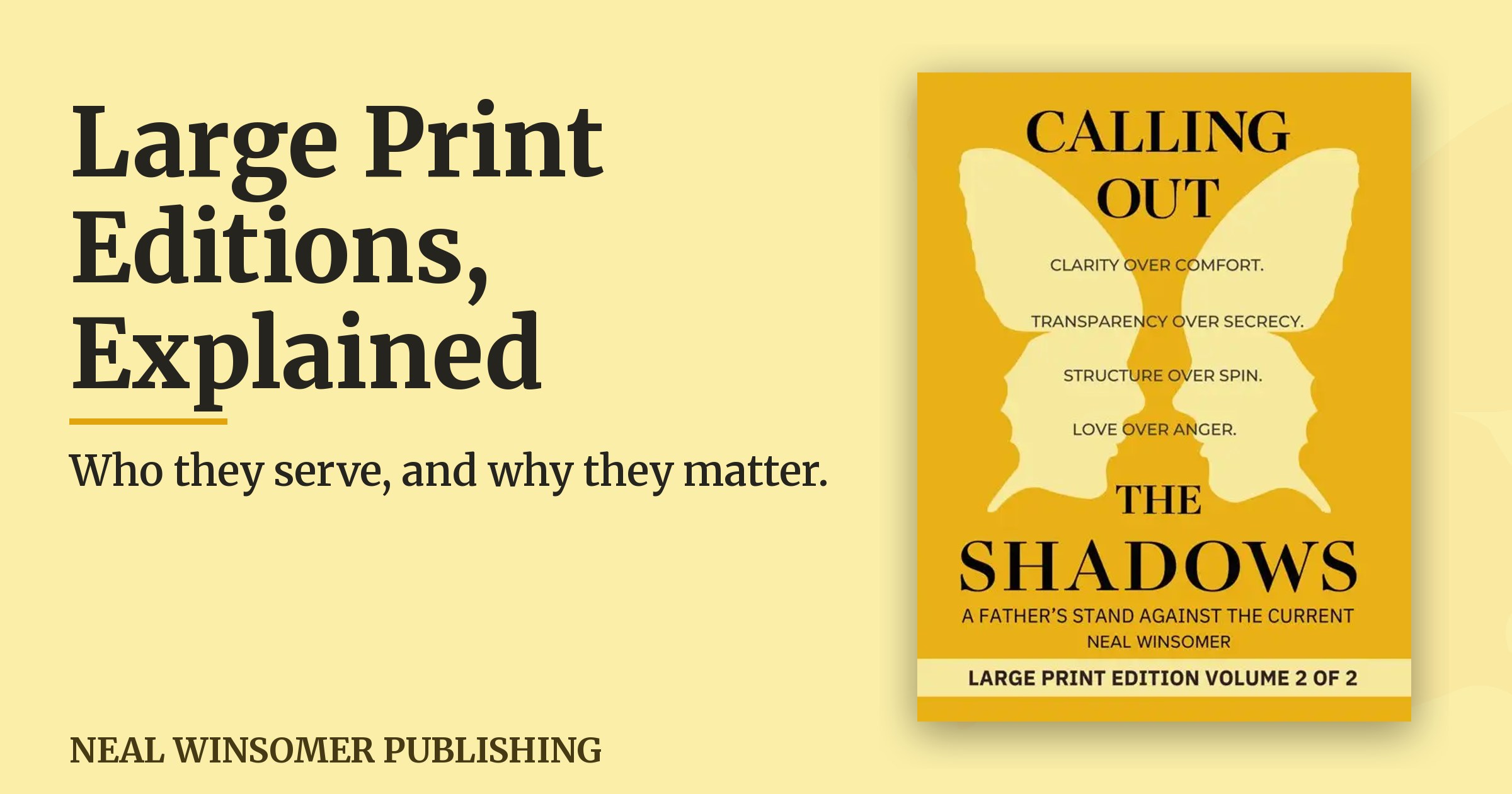
I came to this because I set my own book, Calling Out the Shadows: A Father’s Stand Against the Current, as 18-point large print editions. Moreover, they release on July 16th, 2026 in two volumes. What I found while making it is why I wanted to write this.
Why large print editions are more than a bigger font
From where I stood, large print looked like a courtesy at first. The deeper I read, the more it seemed closer to a right.
Under Title III of the Americans with Disabilities Act, public accommodations are required to provide auxiliary aids and services. Because of this, people with vision loss and other access needs gain equal access to information. Printed material in an accessible format is one of those aids (Source: ADA.gov Title III Technical Assistance Manual). Large print sits inside that world of accommodation, alongside braille and audio, as a non-digital way to keep the door to reading open.
Still, there is a measurable standard underneath it. The National Library Service for the Blind and Print Disabled is part of the Library of Congress. It notes that the minimum size for large print edition materials, as defined by the U.S. Postal Service Free Matter for the Blind mailing standard, is 14-point type. Additionally, large-print materials are most commonly produced in 16- to 18-point type for easier readability (Source: Library of Congress, National Library Service).
The American Council of the Blind, in its 2022 large print guidelines, recommends 18-point as its base size. It also advises generous line spacing and margins (Source: American Council of the Blind, Large Print Guidelines). For this reason, I set Calling Out the Shadows in 18-point type. That choice meets the upper recommendation rather than the minimum.
What the research shows about who large print serves
I am not a researcher, so I leaned on people who are. What I found seemed to point in the same direction from several angles at once.
Large print editions, accessibility, and the law
Libraries, schools, businesses, and government agencies carry obligations to provide accessible formats. Consequently, printed large print is one way those obligations are met in the physical world, away from a screen (Source: ADA.gov). For a reader with age-related low vision, cataracts, or macular degeneration, large print can help. Indeed, it can restore independent reading without reaching for a magnifier every few lines (Source: Library of Congress, NLS).
The scale is larger than I first pictured. In fact, the World Health Organization reports that at least 2.2 billion people live with a near or distance vision impairment (Source: World Health Organization).
Classrooms and struggling readers
The finding that stayed with me came from an independent study by Project Tomorrow for Thorndike Press. In total, it covered roughly 1,500 students in grades 4 through 12, and 56 teachers and librarians across 13 U.S. schools. In it, 71 percent of teachers reported that large print improved students’ Lexile reading scores by two grade levels, and 55 percent of teachers observed increased reading comprehension specifically among students diagnosed with ADHD.
Similarly, the same study reported that large print benefitted students anxious about reading. Notably, 91 percent of teachers observed that benefit (Source: Cengage Group, Thorndike Press / Project Tomorrow study).
Eyes, rest, and the body
Wider spacing and larger letters can ease the physical work of reading. Some describe this as less eye strain and fewer tension headaches over a long sitting. A printed page also can offer a rest from screens. Specifically, it is a high-contrast, matte surface that keeps the mind engaged while the eyes step away from blue light.
There is research underneath that comfort as well. A peer-reviewed study in PLOS One found that for readers with macular disease, doubling the line spacing increased reading speed by roughly 26 percent with high-contrast text and up to 46 percent with lower-contrast text (Source: PLOS One, Enhanced Text Spacing Improves Reading Performance in Individuals with Macular Disease). For me, holding an 18-point page was a quieter way to read.
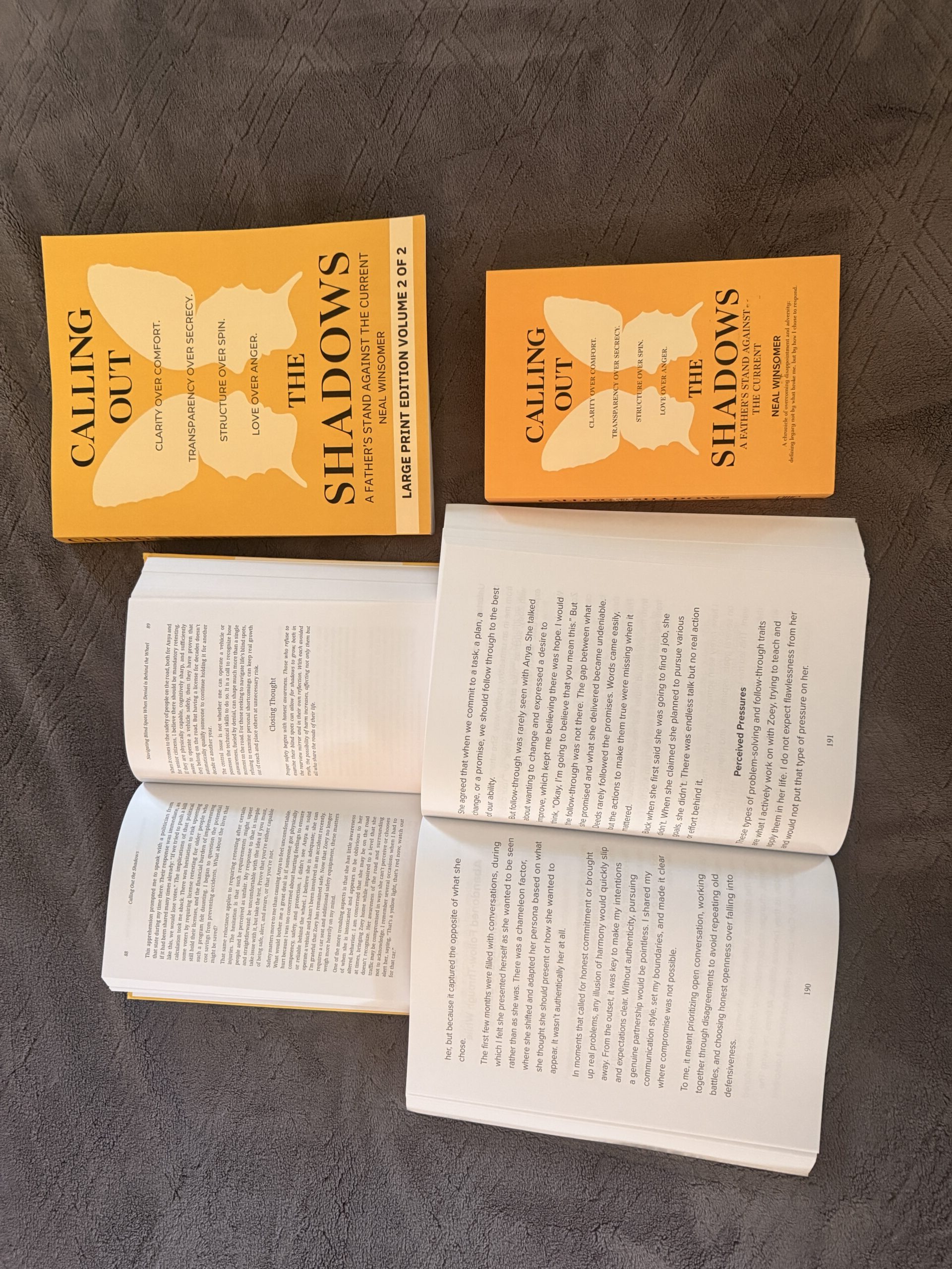
Why I released Calling Out the Shadows as large print editions
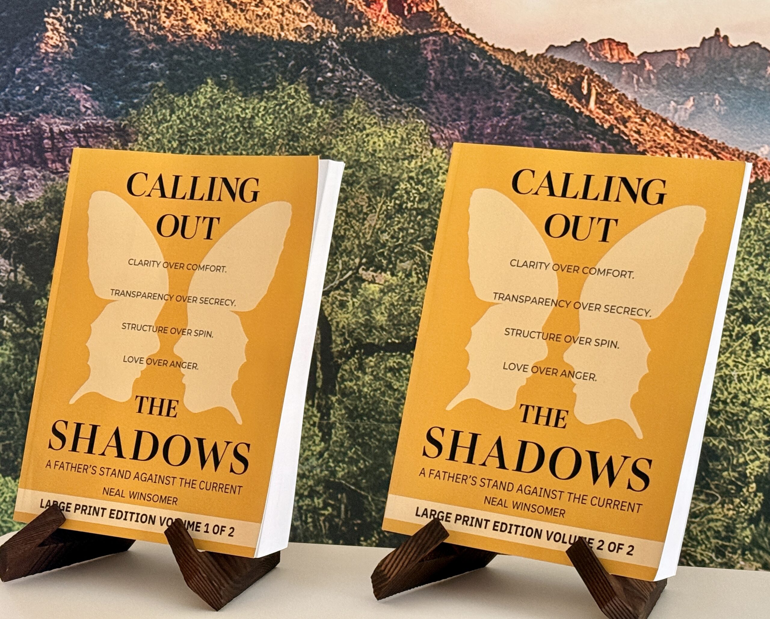
The standard edition runs a bit past 500 pages. Set in 18-point type at an 8.5 by 11 inch trim size, the large print edition runs over 900 pages in total. For the printing with KDP and IngramSpark, it is more than a single printed version can hold. That’s why I released it as two volumes rather than one. As a result, the reading stays comfortable and the pages stay easy to turn… and I can stay in rules and regs with the printers.
Volume One carries the narrative at 562 pages. Volume Two carries the appendices, the reference material, and the tools at 368 pages.
Calling Out the Shadows: A Father’s Stand Against the Current is a memoir and a practical guide. It documents one father’s decision to meet high-conflict custody with clarity, documentation, and restraint. I wrote it in plain first person. Above all, I set it as large print editions because I wanted it to be easy to read for the people it might reach.
Perhaps the large print edition format is one you or a reader in your life has been looking for. If so, the large print editions are available on July 16th, 2026 through the publisher. You can find it here: the book page and the store.
Maybe others will recognize this approach, and maybe an easier page will help some.
Either way, it may be something to consider with your book.
The simple adjustment in formatting might bring an added audience to your book and be worth it down the line.
Frequently asked questions
What is the minimum font size for a large print edition?
The minimum size for large print edition materials, as defined by the U.S. Postal Service Free Matter for the Blind mailing standard, is 14-point type, and large print is most commonly produced in 16- to 18-point type (Source: Library of Congress, NLS). The American Council of the Blind recommends 18-point as a base size (Source: ACB).
Are large print editions required for ADA compliance?
Under Title III of the ADA, public accommodations must provide auxiliary aids and services to ensure equal access to information. Accessible print formats are among those aids (Source: ADA.gov Title III Manual).
Do large print editions help students?
In an independent Project Tomorrow study for Thorndike Press, 71 percent of teachers reported large print improved students’ Lexile scores by two grade levels, and 55 percent observed increased comprehension among students with ADHD (Source: Cengage Group).
What size is the Calling Out the Shadows large print edition?
It is set in 18-point type at an 8.5 by 11 inch trim size, across two volumes, released July 16th, 2026. Volume One is 562 pages and Volume Two is 368 pages.
Share: X · Facebook · LinkedIn · Email
More from the book: Pull quotes · All formats and retailers